🔮 BootStrap5 클래스 이름 익혀보기

부트스트랩 클래스명 총정리
중단점 클래스명
| Breakpoint | Class | Dimensions |
| X-Small | None | <576px |
| Small | sm | ≥576px |
| Medium | md | ≥768px |
| Large | lg | ≥992px |
| Extra large | xl | ≥1200px |
| Extra extra large | xxl | ≥1400px |
width / height
// width
.w-25 == width: 25%
-25, 50, 75, 100, auto

// height
.h-50 == height: 50%

// max-width
.mw-40

// max-height
.mh-100

// viewport
min-vw-100
min-vh-100
vw-100
vh-100
텍스트 색상
// 텍스트 색상
.text-primary, white, muted, ...
텍스트 정렬
// 가로 정렬
.text-start, end, center

// 반응형 정렬
text-sm-start, ...
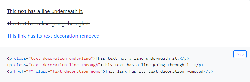
텍스트 줄바꿈
// 강제 줄바꿈
.text-wrap

// 오버플로우 (텍스트 박스보다 내용물이 넘쳐도 그대로 출력)
.text-nowrap

// 자동 줄바꿈 (텍스트 박스보다 내용물이 넘치면 자동 개행)
.text-break
텍스트 대소문자
.text-lowercase, uppercase, capitalize
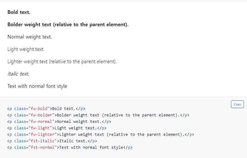
폰트 크기
.fs-1 ~ 6
폰트 속성
텍스트 행 사이 간격 (행간)
// line-height
.lh-1
.lh-sm
.lh-base
.lh-lg
margin / padding
// 일반
{property}{sides}-{size}
.mt-0
.ms-1
.p-3

// 반응형
{property}{sides}-{breakpoint}-{size}
.me-md-2{property}
- m - margin
- p - padding
{sides}
- t - mt = margin-top / pt = padding-top
- b - mb = margin-bottom / pb = padding-bottom
- s - ms = margin-left / ps = padding-left (RTL에서는 반대)
- e - me = margin-right / ps = padding-right (RTL에서는 반대) (아니 l이나 r로 하면되지 왜 s,e로 했대...)
- x - *-left and *-right. 즉 가로 부분
- y - *-top and *-bottom. 즉 세로 부분
- blank - 그냥 m또는 p만 쓰면 4방향 지정
{size}
- 0 - for classes that eliminate the margin or padding by setting it to 0
- 1 - (by default) for classes that set the margin or padding to $spacer * .25
- 2 - (by default) for classes that set the margin or padding to $spacer * .5
- 3 - (by default) for classes that set the margin or padding to $spacer
- 4 - (by default) for classes that set the margin or padding to $spacer * 1.5
- 5 - (by default) for classes that set the margin or padding to $spacer * 3
- auto - margin to auto
중앙 정렬
<div class="mx-auto" style="width: 200px;">
  Centered element
</div>
border
// 테두리 방향
.border-top, end, bottom, start

// 테두리 색상
.border-primary, white, ...

// 테두리 두께
.border-1 ~ 6

// 테두리 둥근 모서리 형태
.rounded-top, circle, pill, ...

// 테두리 둥근 모서리 크기
.rounded-0 ~ 3
background
// 배경색
.bg-primary, white, ...

// 배경 그라데이션
.bg-gradientdisplay
// xs크기 에서만 적용
.d-{value}
.d-inline-block
.d-grid

// 중단점 명시
.d-{breakpoint}-{value}
.d-lg-block

/* value 값 */
none
inline
inline-block
block
grid
table
table-cell
table-row
flex
inline-flex
반응형 요소 숨기기
| Screen size | Class |
| Hidden on all | .d-none |
| Hidden only on xs | .d-none .d-sm-block |
| Hidden only on sm | .d-sm-none .d-md-block |
| Hidden only on md | .d-md-none .d-lg-block |
| Hidden only on lg | .d-lg-none .d-xl-block |
| Hidden only on xl | .d-xl-none .d-xxl-block |
| Hidden only on xxl | .d-xxl-none |
| Visible on all | .d-block |
| Visible only on xs | .d-block .d-sm-none |
| Visible only on sm | .d-none .d-sm-block .d-md-none |
| Visible only on md | .d-none .d-md-block .d-lg-none |
| Visible only on lg | .d-none .d-lg-block .d-xl-none |
| Visible only on xl | .d-none .d-xl-block .d-xxl-none |
| Visible only on xxl | .d-none .d-xxl-block |
인쇄할 때 표시 여부
: 인쇄화면에서 인쇄버튼이 보이면 안되니까, 그런걸 숨길 때 사용
.d-print-none, inline, grid, ...<div class="d-print-none">Screen Only (Hide on print only)</div>
<div class="d-none d-print-block">Print Only (Hide on screen only)</div>
<div class="d-none d-lg-block d-print-block">Hide up to large on screen, but always show on print</div>
float
.float-start, end, none

// 반응형
.float-sm-start, ...
user-select
: 텍스트 복사 드래그
.user-select-all, auto, none
pointer events
: 특정 요소에서의 클릭 이벤트를 동작하지 않도록 제어
[CSS] 📚 pointer-events : 클릭 이벤트 방지
pointer-events css를 사용하여 클릭이벤트를 제어할 수 있을까요? 그 방법 중 하나가 바로 CSS 프로퍼티인 pointer-events입니다. 이 프로퍼티를 사용하면 특정 요소에서의 클릭 이벤트를 동작하지 않
inpa.tistory.com
pe-none, auto
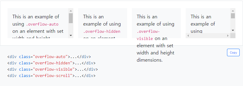
overflow
보이기/숨기기
.visible
.invisible
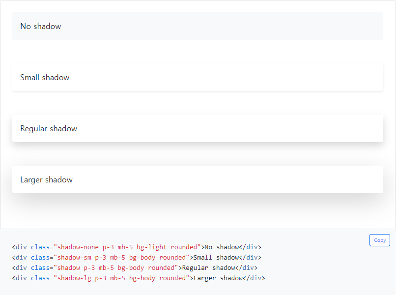
그림자
position
// position : 속성
position-static
position-relative
position-absolute
position-fixed>
position-sticky
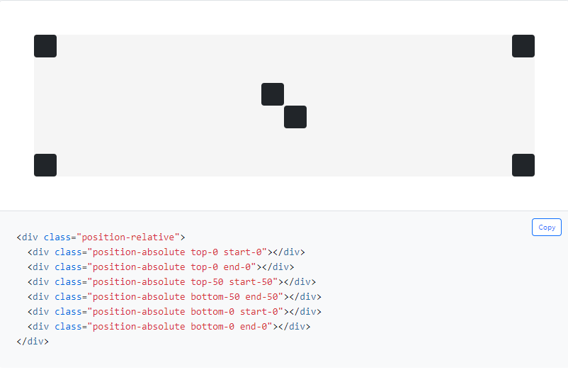
top, left, right, bottom
top-0, 50, 100
start-0, 50, 100
property :
- top - top position
- start - left position (in LTR)
- bottom - bottom position
- end - right position (in LTR)
position :
- 0 - for 0 edge position
- 50 - for 50% edge position
- 100 - for 100% edge position
translate
top-50 start-50 으로 하면 중앙으로 갈것 같지만, 중앙에서 살짝 어긋나게 됩니다.
translate 클래스를 쓰면 정확히 중앙으로 정렬 할 수 있습니다.
// 요소 중앙 배치
.translate-middle

// 요소를 가로 또는 세로 방향으로 중앙 배치
.translate-middle-x
.translate-middle-y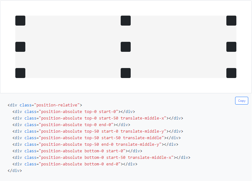
flex
// display: flex;
.d-flex
.d-inline-flex

// 반응형
.d-sm-inline-flex
.d-xxl-inline-flex
방향
// flex-direction
.flex-row
.flex-row-reverse
.flex-column
.flex-column-reverse

// 반응형
.flex-sm-row
.flex-md-column
...
전체 정렬
// 가로 정렬
.justify-content-start
.justify-content-end
.justify-content-center
.justify-content-between
.justify-content-around
.justify-content-evenly

// 세로 정렬
.align-content-start
.align-content-end
.align-content-center
.align-content-around
.align-content-stretch

// 반응형
...
아이템 정렬
// 한줄 세로 정렬
.align-items-start
.align-items-end
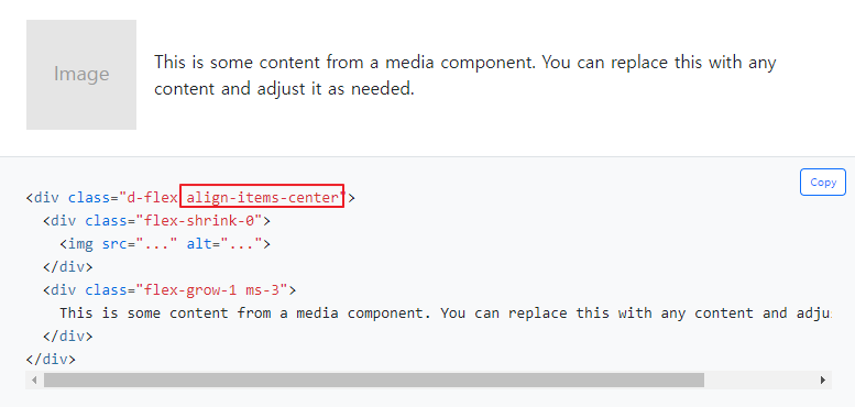
.align-items-center
.align-items-baseline
.align-items-stretch
// 아이템 하나 세로 정렬
.align-self-start
.align-self-end
.align-self-center
.align-self-baseline
.align-self-stretch
// 반응형
...
채우기
일련의 형제 요소에 .flex-fill 클래스를 사용하면 사용 가능한 모든 가로 공간을 차지하면서 콘텐츠와 동일한 너비 (또는 콘텐츠가 테두리 상자를 초과하지 않는 너비)로 강제 설정합니다.
.flex-fill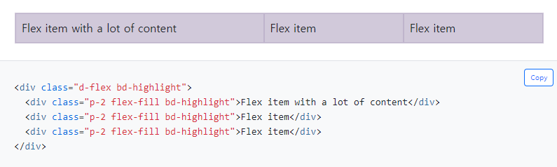
아이템 크기
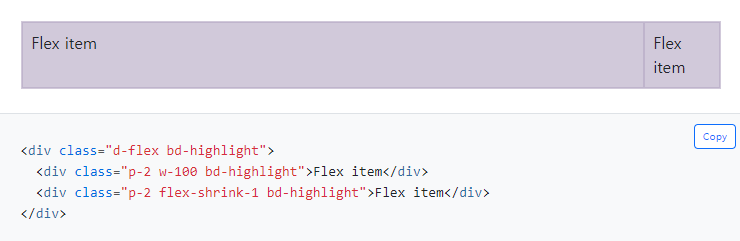
.flex-{grow|shrink}-0
.flex-{grow|shrink}-1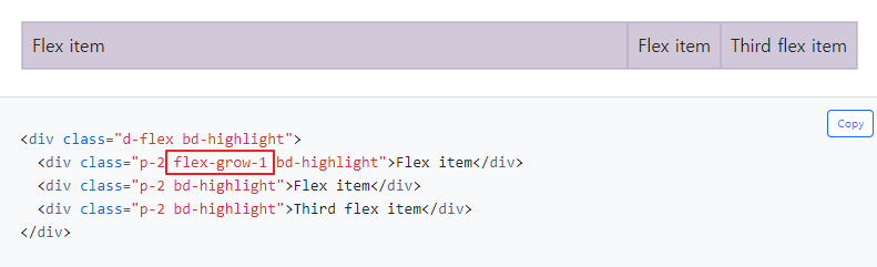
자동 마진
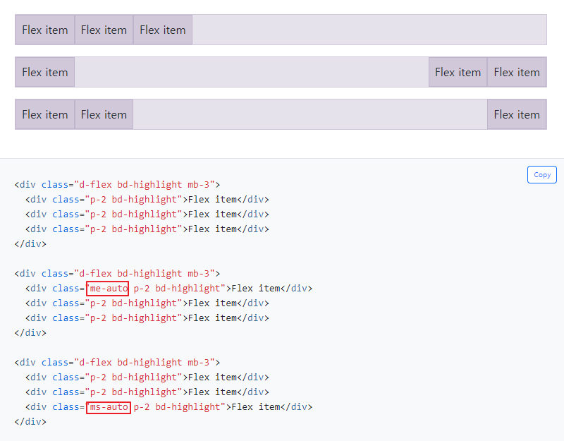
Flexbox는 플렉스 정렬과 자동여백을 혼합할 때 꽤 멋진 일을 할 수 있습니다. 아래는 자동 마진을 통해 플렉스 항목을 제어하는 세 가지 예시입니다. 기본값 (자동 마진 없음), 두 항목을 오른쪽으로 밀기 ( .me-auto ), 두 항목을 왼쪽으로 밀기 ( .ms-auto ).
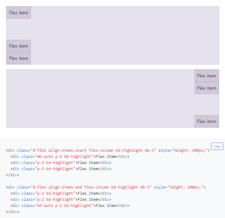
align-items , flex-direction : column , margin-top : auto 또는 margin-bottom : auto를 혼합하여 하나의 플렉스 항목을 컨테이너의 상단 또는 하단으로 수직 이동 시킵니다.
줄바꿈
// flex-wrap
.flex-wrap
.flex-nowrap
.flex-wrap-reverse

// 반응형
...
순서
// 숫자로 순서 지정
.order-0 ~ 5

// 각각 order : -1, order : 6 과 같다
.order-first
.order-last

// 반응형
...
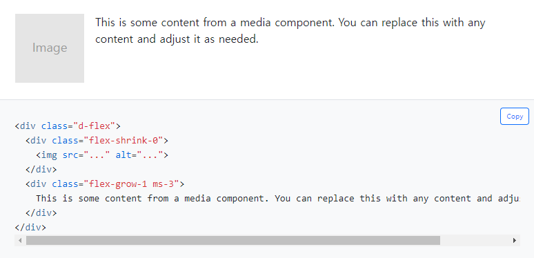
미디어 객체
# Reference
https://getbootstrap.kr/docs/5.0/getting-started/introduction/